Ontario Student Voices
Re-branding
I was hired by OSV to complete a rebranding for them. They were a relatively new organization with a clear audience and mission, but they were very unhappy with how their current branding looked. They wanted everything from a new logo to updated typography and a refreshed colour palette. They asked that I design all of these elements and compile them into a cohesive brand book.


Step 1:
Understanding the Company
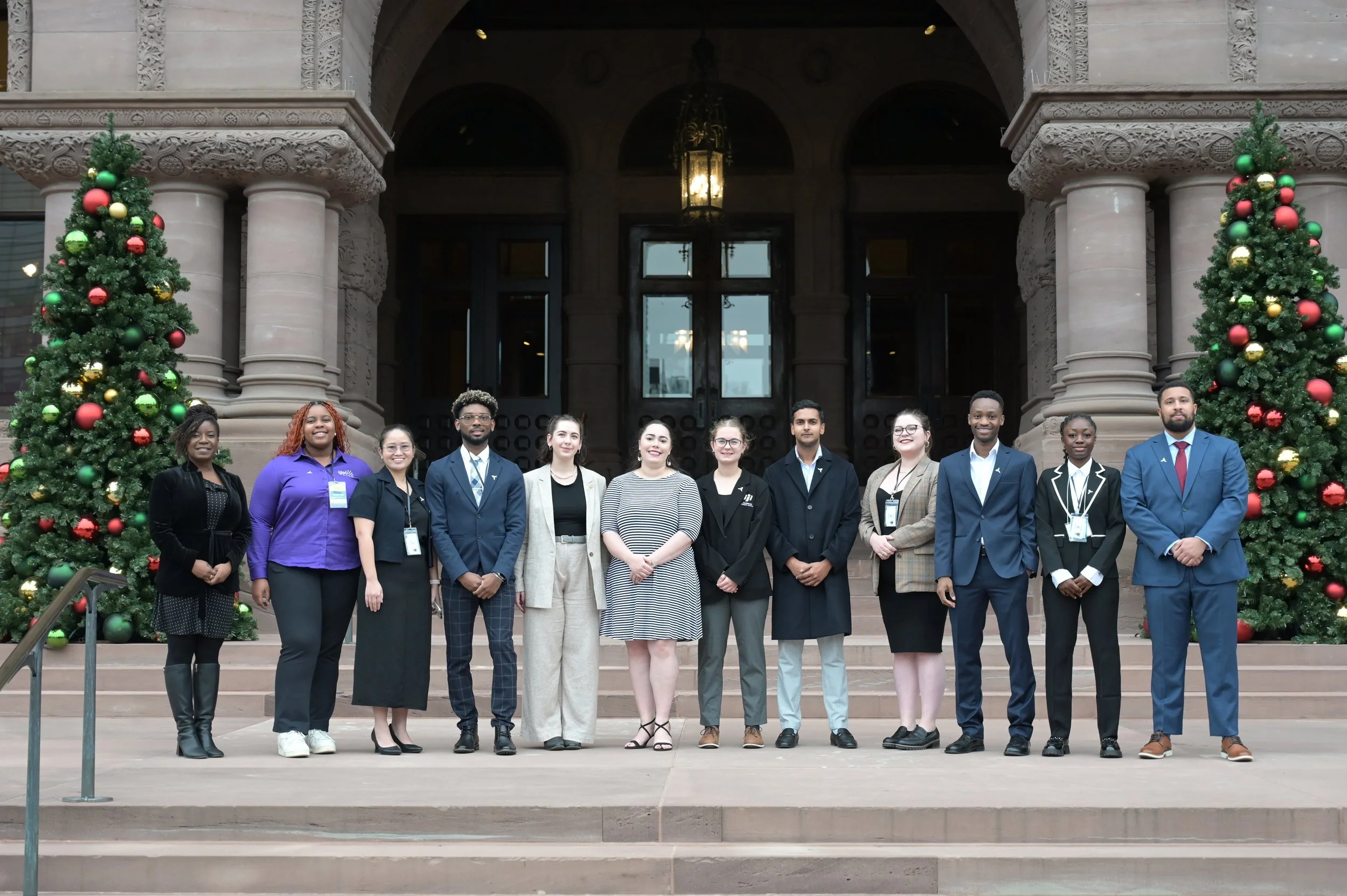
My first step was to take some time to fully understand the brand. I met with all of the members of the organization and did my own research from their website and any public articles about them. I feel like this gave me a good idea of what they were looking for.
Step 2:
Colour Pallet


My second step in the visual rebrand was to create a new colour palette. I focused on selecting a well-balanced range of colours that felt vibrant, modern, and professional. Since OSV does advocacy work at the provincial level, it was especially important to avoid colours that are strongly associated with political parties, to maintain a sense of neutrality and inclusivity.
Light Teal:
#8cd1c7
Yellow:
#fde054
Teal:
#09606c
Black and White
#000000 #FFFFFF

Step 3:
Typography
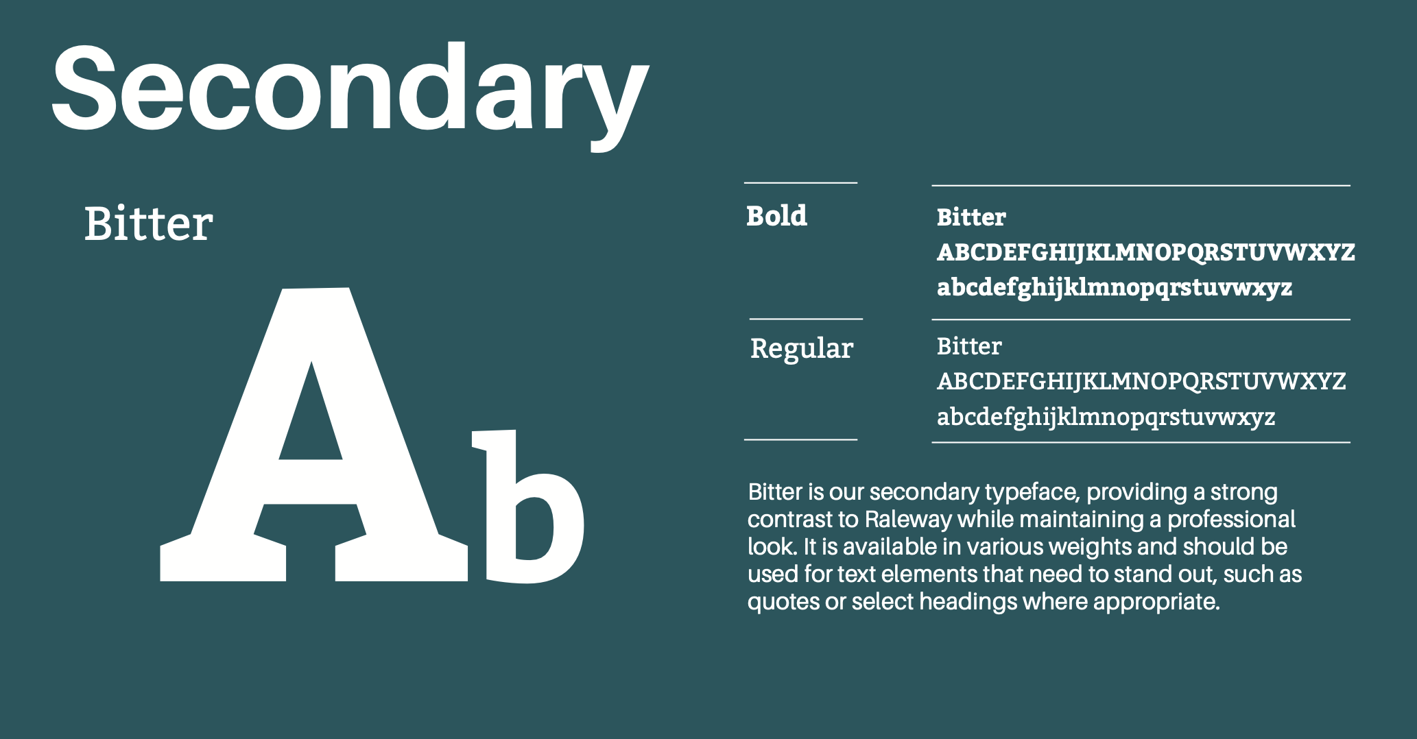
The next step in the rebranding process was to refresh their typography to better reflect the tone and personality of the OSV brand. I wanted to ensure that the typefaces felt both professional and approachable, aligning with the organization’s mission and audience. After exploring a variety of font pairings, I selected Raleway as the primary typeface. Its clean, modern, and geometric style gives a polished and trustworthy feel, making it well-suited for headings and prominent text. For the secondary font, I chose Bitter, a serif typeface that balances out Raleway's sleekness with a bit more warmth and readability ideal for longer blocks of body text. Lastly, I incorporated Above the Beyond as an accent font to add a unique and creative touch for special moments in the brand, such as pull quotes, social media graphics, or campaign headlines.


Step 4:
Logo Design

I started out with the logo design. I began by sketching out the ideas I had, and once I was happy with them, I moved on to building them in Adobe Illustrator. I made sure to create a full primary logo, a shortened version, and a more unique, stylized option. Each version was developed in multiple colour variations to ensure versatility across different uses and platforms. I aimed to provide a range of options with enough variety to suit different branding needs while maintaining a cohesive visual identity.

Step 5:
Putting Together a Brand Book
Putting together the entire brand book was the final step in the rebranding process. This comprehensive guide included clear direction on visual identity, such as which types of photos are appropriate to use and which should be avoided, examples of correct and incorrect logo usage, and other essential brand rules. The goal was to ensure consistency across all communications and make it easy for anyone working with the OSV brand to apply the visual elements correctly. To view the complete brand book, follow the link below.
